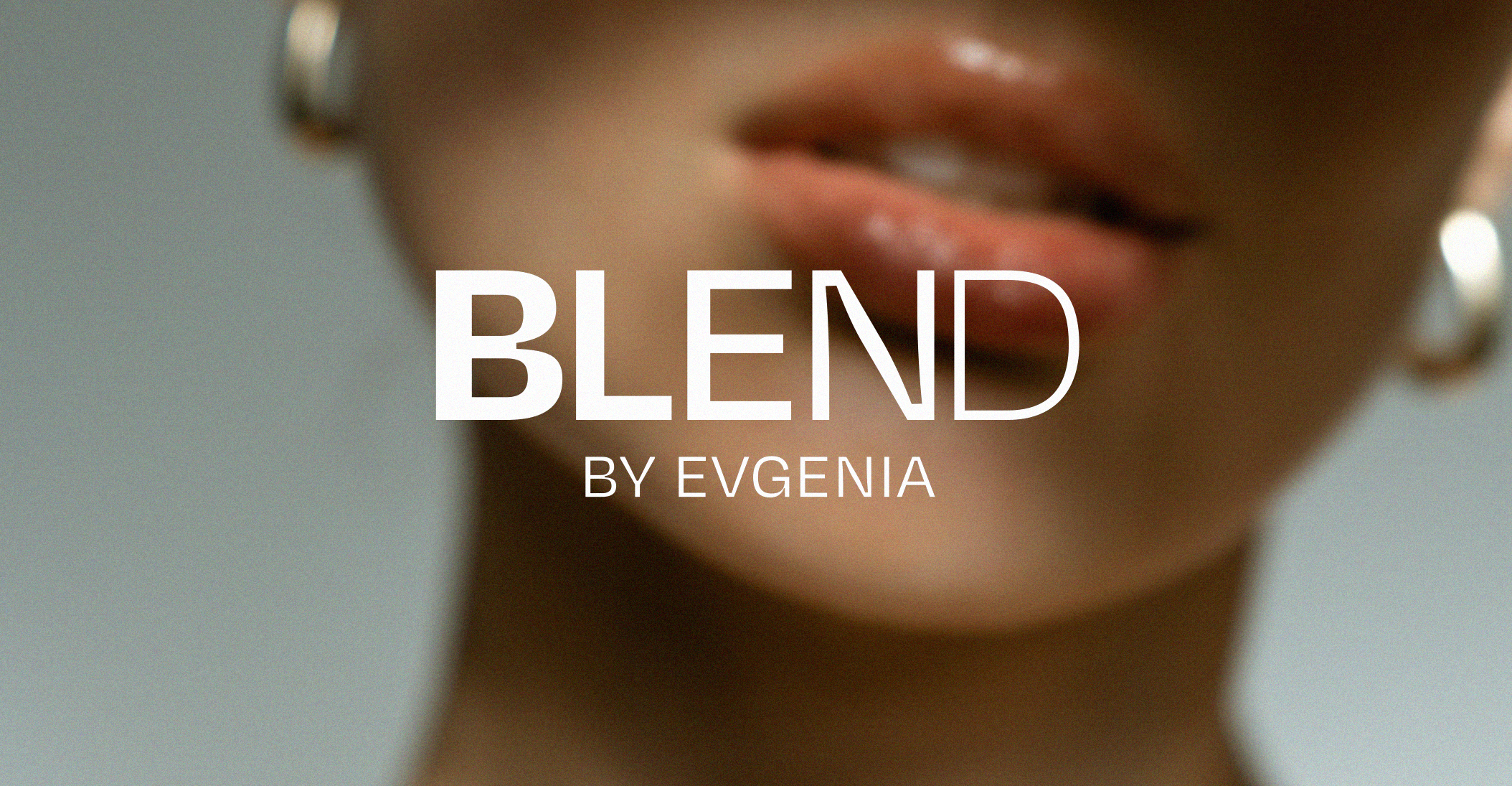
Rather than following the visually crowded approach often seen across beauty brands and independent makeup artists, we chose a cleaner and more contemporary direction.
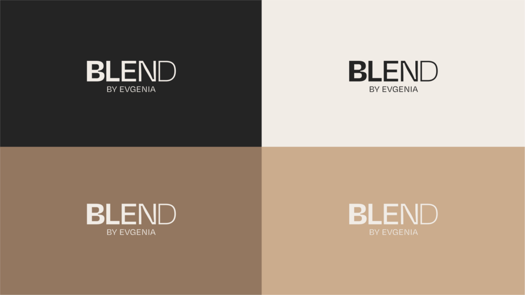
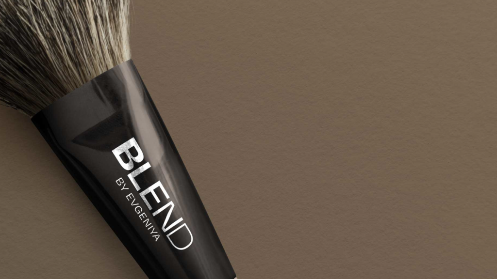
For the logotype, we developed a typography-driven solution with strong readability and a confident presence. Depth and sophistication were achieved through subtle design details and minimalist styling, resulting in a refined visual expression.
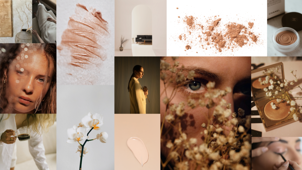
The overall visual language was built around:
- A neutral color palette
- Soft lighting
- Natural skin textures
- Close-up imagery and details
- Editorial-inspired aesthetics influenced by the fashion industry
This positioning places BLEND closer to the premium beauty segment rather than conventional makeup services.